


Most email teams still treat risk assessment as a simple probability x impact exercise, but that leaves out the part that usually hurts campaigns most, the confidence behind the estimate itself. PMI's qualitative risk guidance explicitly adds precision as a third quantity, because likelihood and impact describe severity, while precision shows how much the team trusts the estimate, and that distinction matters when the data is thin or noisy (PMI). A list can look “managed” on paper and still be judged with too much certainty.
Why a Simple Risk Matrix Is Not Enough for Email Programs
A simple matrix tells you whether a list looks risky. It does not tell you whether the estimate is trustworthy, whether the verifier is calibrated, or whether the program is improving outcomes over time. That gap is where many email teams go wrong. They stop at severity and never test whether the scoring system itself deserves attention.
Beyond severity, confidence and outcomes
PMI's framing is useful because it treats precision as a separate quantity, apart from likelihood and impact. For email operations, that raises the harder question, how much do you trust the verifier's judgment on this list, not just the label it returned? A clean-looking matrix can still overstate certainty when the sample is thin, stale, or skewed toward one acquisition source. In that case, the score looks orderly while the underlying evidence is weak.
A bounce estimate should not be treated as a final verdict. If the sample behind it is narrow or biased, the matrix can create a false sense of control. A team that only watches probability and impact can miss model drift, over-flagging of good addresses, or bad addresses slipping through. For teams that want to <a href="https://billionverify.com/email-verification">check email addresses for bounces</a> before a send, the quality of the estimate matters as much as the label itself.
The better frame is layered. Risk assessment metrics for email should cover severity, confidence, and program effectiveness together, because a score that cannot be trusted is just decoration. Open University's KPI framework for risk includes treatment progress, control performance, incidents, coverage, and maturity, which fits a verification program that has to show it is reducing harm, not just producing labels (Open University).
Practical rule: if the matrix is the only artifact your team reviews, you are probably measuring narrative comfort, not risk.
The other metric teams miss is the verifier's own discrimination, the ability to separate risky addresses from safe ones. If a tool is noisy, its confidence band is wide even when the risk label looks neat. That matters more than a tidy heat map, because a bad call at the list level still sends to a live audience. The deliverability features at Stamina show why verification should be judged on how it changes decisions, not just on how it colors a chart, and they sit alongside the broader operational checks that keep the send list honest.
A matrix is useful for triage. It is not enough for email programs that need to know whether the score is calibrated, whether the verifier is separating good records from bad ones, and whether the controls are getting better. That is the difference between saying a list looks risky and knowing the risk score is reliable enough to act on.
Core Risk Metrics Every Email Marketer Should Know
The most useful risk vocabulary is simple, but only if you attach it to list hygiene decisions. In email operations, the question is never just “is this bad,” it's “how bad, how much, and how much of the list is affected.” That's where the core metrics become practical.
The language behind the numbers
Probability is the chance an address hard-bounces, lands in a spamtrap, or creates some other deliverability problem. In list-cleaning terms, it answers whether a record is likely to fail when you send to it. For a marketer, this is the first filter, because even a small rise in bad-address probability can make a clean campaign look unstable.
Impact is the cost of that failure. In email, the damage isn't limited to one lost send, it can include sender reputation strain, inbox placement loss, and wasted media or automation spend. If probability says “how likely,” impact says “how painful.”
Expected loss combines those two and turns risk into a budgetable idea. The simple form is probability multiplied by impact. That formula is common in risk work, and in email it becomes the cleanest way to compare one risky source against another before a campaign goes out.
Exposure is the share of your list sitting in a risky band. A segment with modest individual risk can still be a problem if too much of the file sits there. Open University's risk KPI framing puts coverage and control performance on the same page for a reason, because a small failure in the wrong place can still touch the whole program (Open University).
Rule of thumb: if you can't say how much of the list sits in a risky state, you don't really know your exposure.
For a practical comparison point, the deliverability features at Stamina are a useful reference when teams want to connect risk language to operational monitoring. BillionVerify is a professional email verification service built to solve one problem, bad email data costs businesses money, so it fits the same basic problem set when you're trying to reduce preventable list loss (BillionVerify).
VaR, or value at risk, is the “worst day” lens. For an email list, it asks what the most damage a campaign could do if a bad slice of the file turns out worse than expected. CVaR, or conditional value at risk, goes further and focuses on the average damage in that bad tail. Those two ideas are useful when a list looks fine on average but has a dangerous upper tail of invalid or risky addresses.
| Metric | Formula | Email example |
|---|---|---|
| Probability | chance of failure | a risky address is likely to bounce |
| Impact | cost of failure | a bounce hurts reputation and placement |
| Expected loss | probability x impact | compare two list sources on one budget line |
| Exposure | share of list at risk | a large segment sits in a disposable band |
| VaR | worst-case threshold view | a campaign's worst plausible failure day |
| CVaR | average of the worst tail | the damage you expect when the tail goes bad |
If you want a public reference point for benchmarking how these ideas map to verification practice, the Email Verification Benchmark gives the right kind of context for operational comparison. The point of the vocabulary is not to sound technical, it's to make list risk discussable in a way marketing, ops, and finance can all follow.
False Positives, False Negatives, and Composite Risk Scores
A verifier can be “strict” and still be wrong in the most expensive way. If it flags too many good addresses, you lose revenue. If it lets bad ones through, you keep paying for deliverability damage. Those are different failures, and they need different metrics.
Reading the score, not just the label
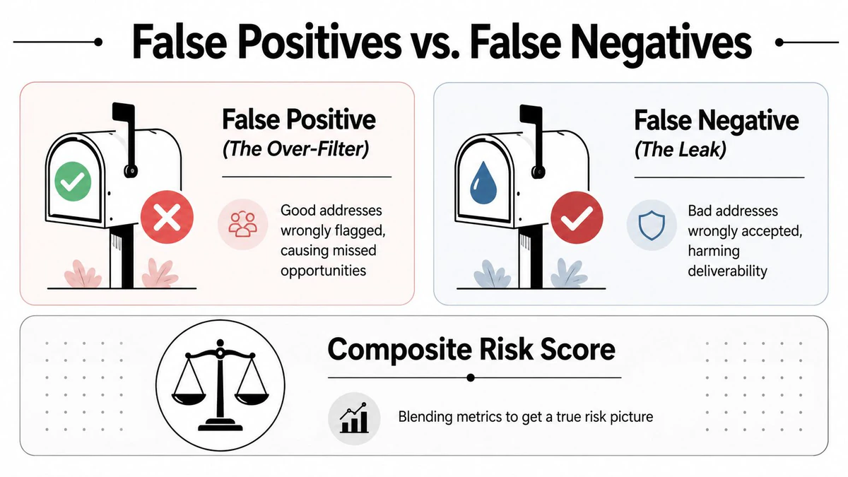
A false positive is a good address wrongly flagged as risky. In email work, that's the over-filter problem. The practical risk is missed sends, lower conversion opportunity, and a file that gets cleaner on paper while shrinking in value. A false negative is worse operationally, because it's a bad address that gets cleared and sent to anyway. That's the leak.
That distinction matters more than the face value of a score. A single 0 to 100 composite label looks neat, but it's only useful if you can inspect the components behind it, syntax, MX, SMTP response, catch-all behavior, and whatever other signals the system uses. Without that visibility, the score is a black box dressed up as certainty.
A score is only useful when the team can explain why it moved.
Open University's risk KPI framework is helpful here because it pushes teams to look at outcomes and control performance, not just labels (Open University). Urban Institute's guidance adds a sharper test for risk tools, accuracy, calibration, and discrimination. Those three words separate a model that sounds good from one that behaves well in real decisions.
- Accuracy: the score should match reality often enough to trust it in production.
- Calibration: the score's levels should mean what the label implies, not just rank addresses loosely.
- Discrimination: risky records should sort away from safe ones in a way that helps decisions.
That's why a catch-all score deserves attention. It isn't a promise that an address is bad, it's a signal that the domain may accept mail generically, which makes certainty harder. A good verifier surfaces that nuance instead of hiding it inside a cheerful numeric score.
If you're reading a verifier's JSON response, the useful question is not “what's the score,” it's “what evidence produced the score, and can I audit the parts that matter for deliverability?” That's the line between a usable composite metric and a decorative one. For email marketers, that difference usually decides whether the tool protects revenue or taxes it.
Email Verification KPIs Mapped to Risk Metrics
Abstract risk terms only help when they attach to a concrete operating threshold. Email teams need a table they can paste into a QA doc and use before the next send, not another vague framework. That means mapping each risk concept to a KPI that can trigger action.
Turning abstractions into triggers
Bounce rate is the cleanest proxy for probability because it shows whether bad addresses are getting through. For operational hygiene, the target after cleaning should stay under 1% post-clean, a threshold often used as the practical ceiling for a healthy send file. If a batch sits above that after verification, the list still carries too much uncertainty to treat as safe.
Impact is less about one statistic and more about the symptom set. Spam complaint rate, inbox placement loss, and the reputation fallout from repeated failures all belong here because they reflect the downstream cost of a bad file. If the program is growing complaint pressure while bounce rate stays flat, the issue may be hidden in list quality rather than send volume.
Exposure maps to the share of the list marked as disposable, role-based, or catch-all. That tells you how much of the file sits in a risky band, not just how many individual records look odd. A disposable rate above 3% is a strong sign of aggressive or low-quality acquisition, and a single confirmed spamtrap hit should force a suppression review, not a “watch and wait” note.
Here's a simple working table for team docs.
| KPI | Maps To | Target | Watch | Action |
|---|---|---|---|---|
| Bounce rate | Probability | under 1% post-clean | rising after verification | pause the send and re-check the source |
| Disposable rate | Exposure | low and stable | nearing 3% | review acquisition quality |
| Catch-all risk score | Uncertainty | low enough to segment | mid-range with no context | quarantine or test separately |
| Spamtrap hits | Impact | none confirmed | any confirmed hit | suppress the source immediately |
| Role-based addresses | Exposure | limited by use case | growing share | route to a different segment |
For teams comparing their own reporting rhythm, the 2026 marketing metrics for RevOps page is a helpful reminder that operational metrics need ownership, not just display. For execution, the SMTP email validation test is the kind of check that fits into a pre-send gate when you need a last-mile validation step.
Decision rule: if a new source pushes disposable addresses above the watch band, don't argue with the dashboard, isolate the source.
The point of these thresholds is not rigidity, it's repeatability. A marketing lead should be able to look at the same KPI twice in two different weeks and make the same kind of decision. If the thresholds are fuzzy, the risk system is just a vocabulary exercise.
Building a Layered Verification Workflow
Good risk metrics come from a pipeline, not a single check. If the workflow is shallow, the score will be shallow too. A layered verification setup gives each stage one job, and that makes the final risk output much easier to trust.
From intake to decisioning
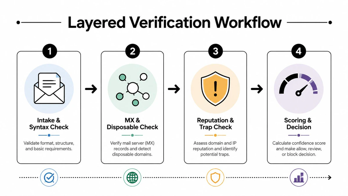
The first layer is intake and syntax. At this stage, the system checks whether the address even looks structurally valid and whether the mailbox format is usable. It's the cheapest place to reject obvious junk, and it prevents later stages from wasting effort on malformed records.
The second layer is MX and disposable checks. MX tells you whether the domain is set up to receive mail, while disposable detection looks for throwaway inboxes that are poor long-term contacts. That stage is where you start separating normal consumer data from low-value or transient entries.
The third layer is reputation and trap review. That's where the verifier looks for signals that can hurt deliverability even if the address is technically active. A clean syntax result doesn't mean a safe address, and a strong workflow doesn't pretend it does.
The fourth layer is scoring and decision. The system turns the evidence into action, reject, quarantine, route to re-engagement, or accept. The score should support segmentation, not flatten every address into one generic verdict.
- Reject: malformed, invalid, or clearly disposable records that don't belong in the file.
- Quarantine: uncertain records that need separate treatment before a send.
- Re-engage: older addresses that may respond to a softer sequence.
- Accept: addresses with enough confidence to join the active send path.
The Email Validation API belongs at signup when you need real-time blocking, while bulk cleaning belongs before campaign launch when the goal is to repair a file already sitting in your CRM. That distinction matters because a signup gate and a pre-send cleanup are solving different operational problems. One stops bad data from entering, the other reduces the cost of bad data already inside.
BillionVerify fits naturally in this kind of workflow because it returns structured verification output, including SMTP results, MX records, catch-all scoring, and deliverability insights. In a layered model, that structure matters more than a single yes-or-no answer. It gives the team enough surface area to make a defensible decision instead of forcing every record into one bucket.
Reporting Cadence and Decision Rules That Trigger Action
Dashboards do not improve deliverability by themselves. A reporting rhythm does. When the same metrics are reviewed on the same schedule, teams stop arguing about definitions and start responding to patterns.
Weekly, monthly, and quarterly discipline
A weekly operational report should stay close to the send surface. Bounce rate, complaint rate, and spamtrap flags belong here because they show whether the latest traffic is safe. Weekly review is where fast action matters most, since a bad source can do damage before the next planning cycle if nobody checks early.
A monthly program review should move deeper into model quality. That is the right place to inspect verifier calibration, false positive trends, and the change in return from cleaning before a campaign. The point is not only whether the list is smaller, it is whether the smaller list is healthier enough to justify the trade-off.
A quarterly risk register should focus on tail risk. That means the campaign types, sources, or acquisition paths that produce the worst outcomes when they fail, plus changes in exposure and overall model performance. Quarterly work should also prove that the process is improving, not just surviving, which is why a control-performance lens matters at that stage.
If a metric does not change a decision, it belongs in a note, not in the top row of the dashboard.
The decision rules need to be blunt enough to use under pressure.
- Pause acquisition: if disposable rate exceeds 3% on any new list, stop that source for 30 days.
- Suppress confirmed traps: if spamtrap hits are confirmed, remove the source from the active path immediately.
- Retest uncertain files: if catch-all risk stays ambiguous, send the segment through a stricter validation pass.
- Review model drift: if false positives rise, inspect whether the verifier is over-flagging good contacts.
- Rebuild the register: if a quarterly review shows repeated tail issues, update the risk taxonomy and reassign ownership.
The BillionVerify accuracy check belongs inside this cadence, especially when a team needs proof that its cleanup process still matches sending goals. That is the job of risk assessment metrics in email, they should tell you when to act, not just what happened.